Lesson 24
by Mary Ann Boysen
HUE, VALUE and SATURATION and their importance in a painting
Color harmony is essential when crafting a complete work of art. This article discusses the meaning and importance of Hue, Value and Saturation.
Hue: This is a term that is used when you are talking of color....red, yellow, blue, green, violet, etc.
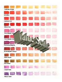
Value: This describes the lightness or darkness of a color

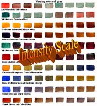
Saturation: This is degree of color, its intensity, clarity or grayness.

All these things go into the making of a great painting, but in specific degrees (color harmony). If the hue, value, and saturation of a painting are equal, there can be no point of interest in the painting....no real focal point or mood, nor any passage that leads the viewer into the subject.
Hue and Color Harmony
When learning about color harmony, many of us are not "technical" people who want to know that exact formula for a particular color, (though there is plenty of technical information out there) but because we are visual people we can quickly figure out which colors are cool (on the blue side) and which are warm (on the red side). It is all determined by the subdominant color that is mixed with the dominant color.
Blue is cool, Red is warm....but the paints that we purchase are not all clearly made of one pure color. Each blue has a different subdominant color mixed in it. So a blue can be a warm blue, another a cool blue. The same with reds. There are warm reds and cool reds. And so forth.
Think of "ice" for cool, and "fire" for warmth. When you squeeze out a bit of color on your palette, and take a brush loaded with water to dilute the color, you can usually tell which secondary (subdominant) color it contains.
If you have a tube of the following colors, mix a little water with them and swirl them around on your mixing tray. You will begin to see the different values and hues within them.
- French Ultramarine Blue - It is not just blue. It has a slight touch of red in it.....therefore it is on thewarm side of "true" blue.
- Thalo Blue and Cerulean Blue - have just a touch of yellow in them, therefore they are on the cool side of the spectrum.
- Cadmium Red Light - is a powerful color and pops when it is used to capture the eye and to intensify the passion of a painting. It has a touch of yellow (subdominant color) in it and is on the warm side of true red.
- Alizarin Crimson - is on the cool side because of the blue tone (subdominant) that permeates it.
- Cadmium Yellow Medium - if you look closely appears on the red (subdominant) side of yellow and therefore is a warm yellow, while
- Cadmium Yellow Light - is on the cool side of yellow.
If these colors are mixed with a complementary color that has the same subdominant color, the result will be a true color, but if mixed with one with the opposite subdominant color, it will have a grayed appearance. This is because it would have all three primary colors in it.
Example: Alizarin Crimson (subdominant blue) mixed with French Ultramarine (subdominant blue) will make a purple. Alizarin Crimson mixed with Thalo Blue (subdominant yellow), will be a grayed purple. Just so you can see which colors are opposite each other, this illustration shows the color wheel that I created for myself in colors that I use:

I discuss this in more detail in my Learning the Basics e-book
You can go through your entire palette to discover how your colors stand up the the line of specific temperatures. Warm and cool colors laid side by side will make a painting vibrate with excitement, so it is important to practice placing these colors together on a "practice" sheet to see the effects that you get. The perfect balance is color harmony
Value and Color Harmony
There are three values in a color harmony: Dark, Medium, and Light (but there can be many in between.

In watercolor, we use water to dilute a color, to make it lighter. We can use it with less dilution for intensity, or we can add Neutral Tintto the color to bring down the value without changing the temperature of the color. The addition of another dark color to the pigment will also bring down the value, but can change the temperature (warm or cool), if that is what is needed.
You may add complementary colors to achieve the same effect (color harmony) if the complement is of a dark value. In the following example, I have mixed a variety of greens by using three yellows and four blues. As you can see, French Ultramarine Blue is a dark value, thus the resulting greens are dark. 
(No need for Neutral Tint here). Cobalt Blue Hue is also a dark but transparent and vibrant color. The resulting greens are more clear and colorful, as it has no red subdominant color in it. With Cerulean Blue (an opaque blue), the resulting greens are more opaque.
You don't need to purchase every one of these colors, but decide what effect you want and only purchase the two colors that give you the results you need.
The following technique is especially useful when painting flowers. Rather than purchasing every color you can find on the market, you can change the HUE of the colors by adding one adjacent to it.
By using colors on the same side of the color wheel (like reds and yellows....warm colors) you can mix vibrant colors.  To each of the yellows on the left side, I added Cadmium Red Light. Then I used Opera added to each yellow, then Rose Madder and Alizarin Crimson. These colors were added individually to each yellow....not all together. For instance, Q-Gold added to Opera created a beautiful Cadmium Orange (but more transparent than that which comes from the tube. Because Rose Madder and Alizarin Crimson are more on the cool side of red, the results were cooler when added to the yellows. The addition of Cadmium Red Lite (a very warm red) the results were very warm and balanced the color harmony To each of the yellows on the left side, I added Cadmium Red Light. Then I used Opera added to each yellow, then Rose Madder and Alizarin Crimson. These colors were added individually to each yellow....not all together. For instance, Q-Gold added to Opera created a beautiful Cadmium Orange (but more transparent than that which comes from the tube. Because Rose Madder and Alizarin Crimson are more on the cool side of red, the results were cooler when added to the yellows. The addition of Cadmium Red Lite (a very warm red) the results were very warm and balanced the color harmony
Paintings need at least 2/3 of one value to give importance to the subject. A dark value (this can be several colors of the same value) will force the eye to the focal point which may lie in the "medium" value of a painting....or in the "high key" area. "KEY" is the term used in describing whether a painting is in a dark value "low key" or a light value, "high key".
Creating Color Harmony with Colorful Grays is Fun
I never use a gray from a tube. Here are some mixtures that will give you an idea of what can be done in this area.

Of course, grays can have warm colors in them also. Warm colors mixed with their complement (a cool color) will also create interesting grays. I will let YOU do this exercise for yourself. Enjoy!
SOFT EDGES add an interesting dimension to a subject.
 Another way to see the values in a painting is to squint your eyes when looking at a subject. Those items that begin to "run together" without a value separation, are of the same value. For instance, a yellow can actually be the same value as a blue. The blue, of course, would have to be a pale blue. When this event appears in a painting, you should blur the edges between the colors so that they run together. These are called "soft" edges. Another way to see the values in a painting is to squint your eyes when looking at a subject. Those items that begin to "run together" without a value separation, are of the same value. For instance, a yellow can actually be the same value as a blue. The blue, of course, would have to be a pale blue. When this event appears in a painting, you should blur the edges between the colors so that they run together. These are called "soft" edges.
Can you see how the onions have soft edges in the shadows?
Soft edges can appear in the light areas as well as the shadows of a painting. See the onion on the right side, just above center. Its top edge blends with the onion behind it providing good balance and color harmony
Saturation and Color Harmony
A true color that has no grayness is said to be at its full saturation point. "Bright" would be a descriptive word! When a bluish red has a bit of yellow added to it, the resulting color would be on the "gray" side. (Previously discussed under HUE) We know that by using three colors on the color wheel (red, yellow and blue) we create a gray. We, as artists, can mix a multitude of grays with the colors on our palette. Grays can be on the bluish side if blue is the dominant color, and on the purplish side, if blue and red are the dominant colors in the mixture.
If you look really closely....I mean REALLY closely, you can actually see the color of an object reflected in its shadow....therefore, shadows are not really gray. We have the power to make them colorful.
Now, saturation is not just color....it can be "de-saturated", the lack of color. When we de-saturate the color of a photograph that is on our computer, we turn it to black, white and gray. Artists should have a form of Photoshop, Photoshop Elements, or another program that allows them to manipulate photos on their computers. Working from black and white photos, and creating your own colors and saturations of colors will be a challenge at first, but it can be an exciting exercise. You can make grass be purple if you like. There is no end to the challenge and the results. Basically, make your own color harmony
 A de-saturated photo will give you a chance to look at true values. A de-saturated photo will give you a chance to look at true values.
 If you compare the color photo with the de-saturated photo, you will be able to see which colors are the same value. If you compare the color photo with the de-saturated photo, you will be able to see which colors are the same value.
DON'T BE DISCOURAGED WITH ALL THIS INFORMATION about color harmony. Just get out your paints and brushes and start painting!
I hope that I haven't confused you too much with color harmony, but have given you some food for thought when working with color. Paintings can be high key, low key, cool dominance, or warm dominance. It is your artistic license that allows you to experiment and have fun with colors and grays alike. Try some of the examples that I have illustrated here, and try them with your favorite colors, or even with colors with which you are not familiar yet. You may discover a new "favorite" palette for yourself....

<<Return to Lesson 23: Painting with Color
Advance to Lesson 25: Using Alcohol for Texture>> |

